Ray Newton, the best black-and-white printer with whom I had the pleasure to work, introduced this idea to me. Agitation and Presentation. That was just about all that professional level photography needed to be right. Of course, there were other things, like composing, focusing, picking good subjects, lighting, a host of others. But if you got these two things wrong, nothing else mattered.
Agitation was a word that was truly related to its time and silver halide photography. That is another way of talking about film. Like a roll of film. Not feature films. But maybe it applies there too, for films shot by guys like Wally Pfister. When I was learning about photography, I can remember reading about daguerrotypes, not imagining that I would eventually ask myself if silver halide was just like that, a technique that was passing away. But, for the moment, all questions aside, let’s talk about agitation and what it means.
I think most people get it. I mean about film. Film has a thin layer of stuff, held within an emulsion of gelatin, that is sensitive to light. That stuff is “silver halide” or some chemical variant thereof and perhaps some dyes. We take pictures on our roll of film and either develop it ourselves or get it developed, then printed. But the part that was in the camera is still the film, often a negative. This means that the part of the image that was bright in real life is darker than the part of the image that was dark in real life. When we project this image on to photo paper, also a negative, it reverses the picture and we can decipher it and see what it is all about. For more than a century we have done that and people from the Queen of England to a campesino in rural Mexico have participated in the process.
Agitation is the moving of the film during the time of immersion in the developing solutions. Does this make all darkroom workers Baptists? (Dumb joke department, I know, I know!) If you have done darkroom work, you know about this. If you put your film into a little light-tight canister for developing, you know that you have to invert the thing after you pour in the developer, tap it to dislodge air bubbles, and do it once a minute or so. This brings fresher developer into contact with the local area of the film so that more activity happens. Otherwise the chemical reactions would slow dramatically and the local area would not continue to change. Okay. Pretty boring. But important. Otherwise dull, mottled, splotchy pictures would be the result. Proper agitation makes for good silver halide photography.
Applying this means that a photographer has to do her technical work well. Or find someone to do it for her. (Editor’s note: to make up for male gender use in times of unknown value for the last fifty years, I will use the feminine gender for the next fifty. Okay?) All of it is summed up in “Agitation…”
Another memory I have from Raymond Newton is taking a class with him at UCLA Extension. Ray always knew about cool things in town. He told me about Garry Winogrand. Garry was a well-regarded photo-artist from New York City. He was a street photographer. He was known for his own work where sometimes a person at the edge of the frame would be only part of the way inside the crop. Or that the camera would not be level. Of course, this is not what his work was about. It was about “light and surface.” But it may jog a memory. He had been friends with Dianne Arbus, also well-known for her photo work. He is the one who pronounced her name for us correctly as DEE Anne, not DIE Anne. He liked to talk about the “work.” He painfully related a story about teaching a class in a southwestern state where the participants of the class spent time sharing their feelings that they had while making the pictures. For him, that was a big waste of breath. It was the “work” itself that mattered. The most clear quote that I remember from his was this one: “I take pictures to see what things look like photographed.” I may not be verbatim, but this is dead on.
He was working on Farmer’s Market at the time I took the class with Ray. He was a bit cryptic, but said that what he saw there troubled him, if I remember right. At that time, Farmer’s Market was there without the Grove, not even a Starbucks, and other developments in the area. It had a lot of older people. I don’t know if he was facing his own mortality; I will leave that to his biographers. His camera was the M Leica. Rangefinder style 35mm camera. And he shot black-and-white film. His developer of choice (meaning the solution into which his film was immersed) was called D-76. It was a Kodak formula. But there was something unique about the way he used it. He did not want to use it when it was fresh, at full activity. He wanted to use it after it had been used for many rolls. The result was that the range of brightness of the image was brought down; it was less contrasty. He used a non-standard agitation in this way. And that meant that he could see better into the shadows and highlights of the image when he printed them on paper. This brings up a point. We can see local contrast in a picture only when it is not black or white, but when it is somewhere in between. In color work, we can see contrast locally only when the color is not fully colorful, reds that are fully red reveal no contrast, for example. And it is in the contrast that we see everything. So this is why Agitation is so important.
Ray Newton had mastered this. His camera of choice frequently was also the M Leica. When we worked together, he favored an Agfa film and exposed it in a unique way. While the film was rated at 400 normally, he would expose it as if it was 25. Then his developer, not known to me, perhaps his own version of “soup,” would make the negatives printable. Way more than printable. The prints he made were the best I have seen to date. I still remember a shot from the beach of a big lady smiling, fully lit by the sun, swimsuit glistening, and seeing the detail and the subject’s joy very well. Maybe there was a kid in the shot, too. I guarantee my readers will find Ray’s work rewarding to the eye.
Ray could make my copy negatives sing. We worked in the world’s biggest darkroom. We could project an image up to 32 feet wide and 20 feet high on our easel. And I shot 8X10 film. But we had a limit of magnification of a little over 39 times with our 12 inch lens on the enlarger. Sometimes we needed more. So Ray would make a great print on paper and make the copy negative with a process camera to just the right size. Then I could print it. He exposed the film, a special dual emulsion type from Kodak, to have the “break” fall in just the right place. The “break” was a bump in the brightness that brought out the beauty of the shot in question. With Ray, the “Agitation” looked great.
Today, we have Photoshop. We can use curves to make “breaks” wherever we need them. They can cover up some things like poor lighting. Or just make something different. And we can shoot color images and later make them black-and-white. I usually use the term monochrome today instead of black-and-white. It is because it is really about the one color involved, even if it is grey. Grey has many shades and tones. Emotions carry in the greys. And sometimes we manipulate to the benefit of our images. At least that is the goal.
Presentation is the other side of the slogan. From this word we see that we must carry our work to the eye of the recipient with care. For a paper print, we mount it. We matte it. We frame it. Or we put it into a book called a portfolio or an album. We always handle it with care. Every step taken will bring value to the experience of the viewer. It is here that distinctions are made. Galleries show work. And we admire it while being dressed up a bit and drinking some wine while talking in hushed voices. Or we see it in a museum. The Getty, the Modern, the National Gallery.
My work is usually seen on screen in the movies or on television. And it is not seen alone, but just as a part of a scene, the background. Probably out of focus, not even much of it shown at a time, it goes unnoticed mostly. And if it does, I have succeeded. It has an impact, subtle to moderate at most. And it must be congruous, it must fit the presentation, the subject matter, be cooperative. It is the role it plays. That is its Presentation.
My challenge is to make the translites that I do to be printed as well as they can be, seamed well, properly edged, with grommets in place, and shipped in new cardboard tubes. I also hope for great rigging grips to hang them and for gaffers to control the lights behind so that they “read” well to camera. This is also my Presentation, depending on others. Some things have changed in my thirty-some years of translite work. We make them in color directly, no longer need any silver halide, and can even add diffusion right in the ink process. No matter the technologies used, keeping the eye on the goal of Agitation and Presentation still matters.


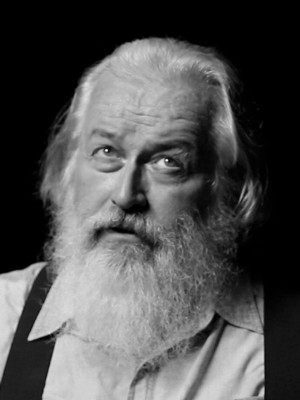
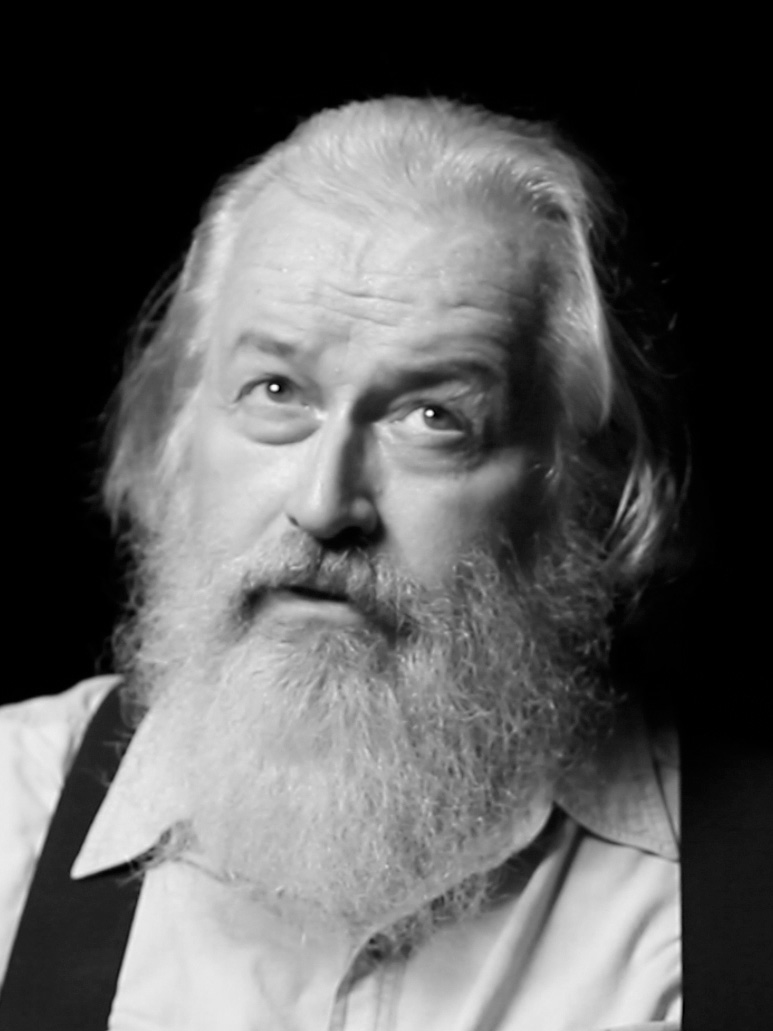
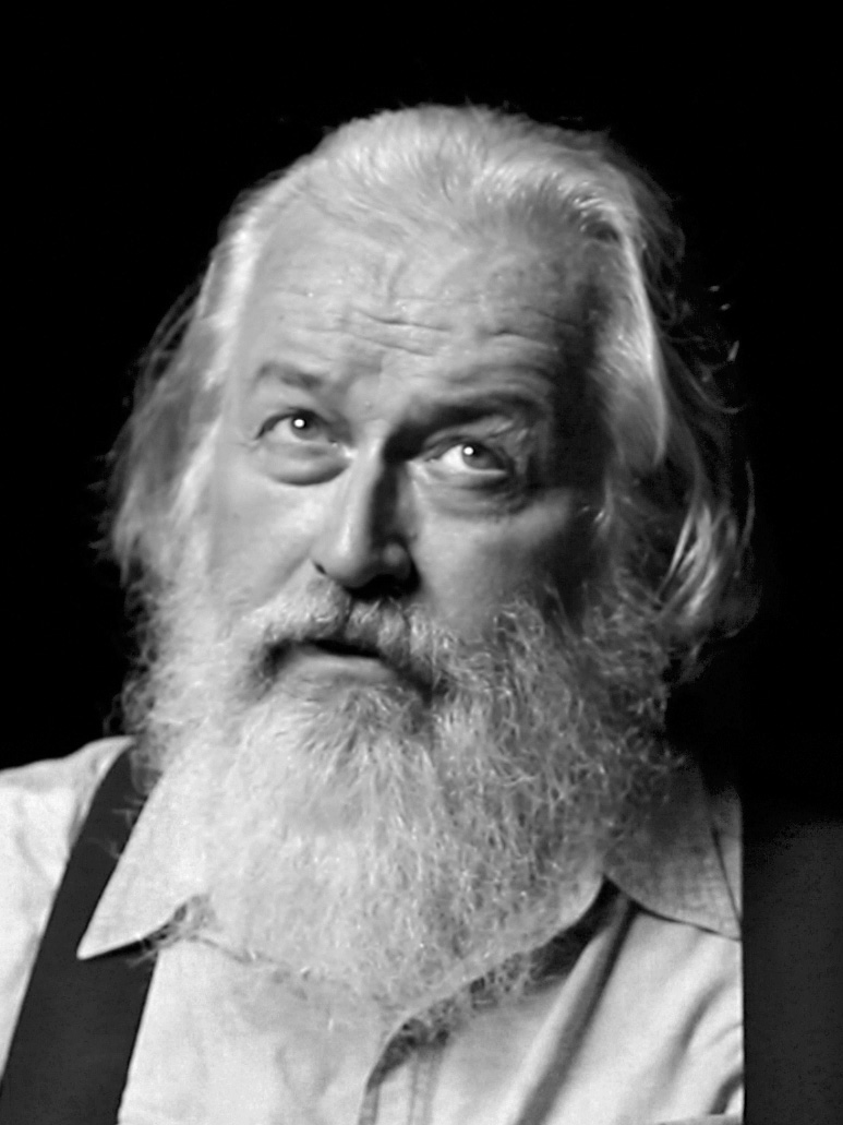
Wow, what a well written article and great portrait! Thanks for the mention, I’m blushing!
I just told the truth.
I love halfcoastal.com , bookmarked for future reference
[url=http://www.buzzfeed.com/bookie/legal-steroids-prohormones-bodybuilding-supple-39dn]buy legal steroids[/url]
I love halfcoastal.com , bookmarked for future reference
[url=http://www.buzzfeed.com/downloadarea/how-to-download-youtube-videos-to-computer-2lp6]how to download youtube videos to computer[/url]
halfcoastal.com is amazing, bookmarked!
[url=http://www.facebook.com/pages/MMA-betting/221344401210163]mma betting[/url]
As a Newbie, I am constantly searching online for articles that can aid me. Thank you
Tahnks for the helpfull input.
What a lovely blog page. I will surely be back again. Please preserve writing!
This is very important. Thank you for sharing this short article.
Thank you for this great post! It has been extremely insightful. I hope that you will continue sharing your wisdom with us.
You are a very clever individual!
Amazing post. Extremely informative. Thanks for writing this.