Welcome to my world – the strange case of baby vision…

Theory of human vision, Babies see funny things, Richard Lund, actor Richard Lund, weird stuff about seeing

Welcome to my world - don't touch that dial! Richard Lund as a baby might see him.

What do we see when we come into this world? And what do we learn to do with that sensory input? Let’s have a look…

Sometimes I see a picture on facebook in someone’s album and it is sideways. That’s okay. I can turn my head if I really need to see it. It is a little disconcerting, but, heh… I can live with it.

But what about my view camera? What do I see there? Those of you who have spent time with one know the secret truth. Everything is upside and backwards inside when you look at the image on the ground glass. Next time you see someone out with a camera on a tripod that has a cloth attached to the back, step up and ask to take a look. It will look something like the picture below.

View camera ground glass, Richard Lund, Building upside down

When you look at the ground glass of a view camera, it looks something like this.

The grid lines are there so that one can adjust the image to be straight if one desires. Hey, I always liked to get things straight. Especially buildings. I remember Doc Baily on Fight Club talking to me after he got the scans from the buildings in Century City that I shot for him. He praised me because they were nearly perfectly straight. He only had to correct a little bit. I guess he was one of the first guys that I met working with wire frame and rendering. If you have another look at Fight Club, he did the exploding building sequences. For the work that IMDB counts as mine, this movie has the most sustained popularity. Doc Baily did his part right. I guess others did, too. 🙂

Before you get a headache, let me show you the building upside right. Okay?

Building across the street for translite view, Richard Lund, translight photography

This is the way you might see it in a normal camera, I mean without the lines.

So what about the baby thing?

Little boy in his father's arms, Richard Lund, Baby vision

This little boy studies the world from his father's arms securely

I seem to have learned a lot from having children of my own. I still remember the day my first baby was born. My wife had gotten up early on a Sunday and was showering. Something happened. She fainted. I knew that she was in labor and I was getting ready to take her to the hospital. Oops. Now I had a soaking wet, naked, full-term pregnant woman passed out on the floor. Let me tell you, I was really glad that she woke up. We dashed to the hospital and in four hours and a little more out came my baby girl. The doctor had a bright light that he shined on the scene of delivery and my baby did not like that one bit. She was crying her little lungs out with her eyes completely shut. Not long after, they gave the baby to my wife and the light was no longer in her eyes. She stopped the crying and I still recall her opening her eyes and looking out at me. I can’t say for certain what she thought at the time, but I know that her eyes worked like all lenses do. The image they provided her brain was upside down and backwards. She was not all that interested in that stuff, of course. Newborns have a wonderful rooting ability and she wanted to nurse. She got what she wanted.
In the coming weeks, she started to notice more things. One day we were watching Little House on the Prairie, a popular television series at the time. Someone on the show began to sing the song Amazing Grace. My little one turned away from nursing to the sound. She seemed to recognize the song. We had sung the song to her before she was born. That was very interesting.
But back to baby vision. Have a look at this next picture.

Baby vision, touching teaches visual processing, Richard Lund, translite photography

She is using her hands to connect what she sees and feels. Visual processing has begun to correct what she sees.

We see this little girl using her hands and her eyes together. She is making sense from her environment. My first little girl had a nickname from me when she was a baby. I called her Private Finger. She would stick out her index finger and use it for her chief tactile investigative tool.

This illustrates my next point that our brains process or fix what we see. Years ago I read about an experiment on vision in the UK. Someone had rigged special glasses for people that turned things upside down and backwards. Volunteers were required to wear them all the time. In a few days, they began to see normally through the glasses. And if they took them off, the world was wrong visually. After the use of the glasses ended, all the people had their normal vision return in a few more days. (I find that the experiment has not been repeated easily, so some doubt, but think about it from the point of origin. We all learn to see “right reading.”) So it illustrates my point. Our brains figure out what we should see and show us the corrected view. Our brains do that first switcheroo and a whole lot more. Have a look at the next shot.

Spherical view of a building, fish-eye view, Richard Lund, translight guy

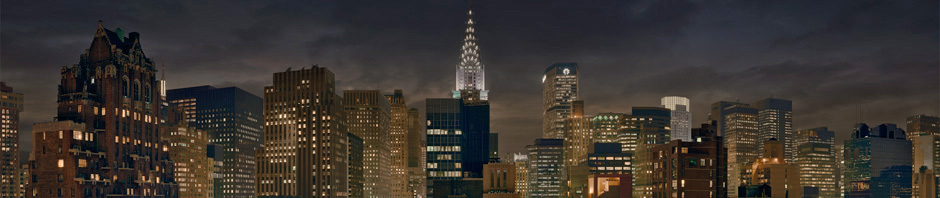
Spherical views like this one show curved lines where we expect to see straight ones.

The lenses in our eyes are known as spherical lenses. That means that the image from the edge is curved. It might not seem like it, but that is because of your brain fixing things. You have learned about buildings and other things that stand upright. Perfectly straight. So your brain figures out what you need and presents what you know to be true. It takes a while to learn this stuff, of course, so don’t hire a two-year-old to build your next house, okay? But what else do we need to learn visually? Actually, quite a bit. One is color. Yes, color. Okay, so we start language skills by someone asking us about stuff and touching it. “Where is baby’s nose? Oh, there it is. And where is Mommy’s nose? Yes, that’s right.” And we read books or talk about color. Grass is green, the sun is yellow, skies are blue. Well, actually more cyan, but who tells a baby that?
I had trouble in kindergarten. Mrs. Zehren was my teacher. A very nice lady. So understanding and kind. Here’s one story about that. We had a classroom with tables and chairs in the front and a play area in the back with actual tools and stuff for the boys. Hammers, nails, saws, id est real tools. I guess the girls were stuck with blocks and dolls. One day, must have been around Thanksgiving, she passed out some papers. For those under a certain age, I will have to explain that some paper could be printed by a mimeograph mechanically to make lots of copies. And we got a very heavy, black line picture of a turkey, in side view, with the head on the left and with several highly stylized blocks of feathers, maybe six or seven of them arranged around the body of the bird. Our assignment was to color the picture and then we could be dismissed to go play. Simple. Right? Well, not exactly. I had my required eight Crayola® Brand color crayons. Black, red, green, blue, violet, yellow, orange, brown… I knew how to color. My hands worked fine. But my brain was stuck. I knew that turkeys were mostly brown and that their feathers had some variation in tone and some on color. And the big blocks must be divided into tiny little parts to make them look like a turkey. All of the other kids went to work. Feather one might have gotten red, then the next yellow or green, and so on. As long as they stayed inside the lines, they were doing a good job. And they all got to play. Except me. I could not figure out how to do it. I could not just color the feathers in one color each, yet I lacked the knowledge and confidence to make them look as I thought they should. I knew turkeys were different from what I saw on everyone else’s paper. The tension built until I could not take it anymore. I was frantic.
My solution was to…cry. Big crocodile tears. And the voice, quivering. “Mrs. Zehren, I can’t do it.” She must have been very wise because she let me go play. The tears were gone pretty quick. I wonder, looking back, if on that day my life’s course was set, to be a photographer. I often said that I did it because I couldn’t draw very well. Maybe it was also that I couldn’t color well enough as well. ¿Quién sabe?

So, babies learn to flip things, straighten things, and that certain things should have certain colors. We know that sunlight and incandescent lights have a different color temperature. Sunlight has a cooler look and old Thomas Edison style light bulbs have more red and are warmer in tone. In a few more years, the Edison bulbs will be gone from my state of California, replaced by flourescents and LEDs. But for now, most of my readers will admit that their friends look pretty much the same in their kitchen, out in the garden, at the beach, and maybe even in a dark night club. The reason is that we know what they should look like and fix the pictures that we see to match. We might see them wearing a red dress and even though the red dress would photograph on old style film differently in different light, one look and we know it is red. Or pink, or white. We don’t even have to think about it. Just gets done for us. Our brain, our vision.

And what does the baby see? I bet color. But what we have learned about how our eyes actually sense color has a real influence. Likely you have heard about rods and cones. In our eyeballs. The rods sense dim light and the cones see the bright stuff. It turns out that the cones don’t see much color, (well that is not exactly true. They see blue light and not red light, but we don’t see it as blue light, just as light.) But we still know what things are in that night club scene. The dress is red.

What we do see is what we expect to see. Hey, let me say it again. We see what we expect to see. Vi ser hva vi forventer å se. (That’s for my Norsk family. You do your own translation at Translate Google.) Cameras do not always record what we expect to see, of course. I guess that is one of my points. But what we expect to see is what we should present as we make photographs and cinema. Back to the cones.

There are three classes of cones. Tall, grande, and venti. Well, sort of. (Too much Starbucks coffee?) And these three sizes see different parts of the color spectrum. We measure color in nanometers (nm) of the wavelength, like a 650 nm wave is red, a 450 wave is blue. And we really have three basic peaks of color sensitivity, red, green, and blue. But we have two main color pairs in vision, blue-yellow (like a Swedish flag) and red-green (like Santa and Christmas). Let us agree to talk about those relationships in an upcoming post. We will talk about simultaneous contrast and more. And we had to talk about the brain and the eyes today to make sense of what is coming.

I learned some things from Kodak over the years. You know, the yellow box company. They have pretty smart engineers. One day they told me about the difference between sensitometry and densitometry. One measures the actual differences in color and the latter measures those differences as seen by people. In my early years of color printing, I could not afford the dial-a-color head on my enlarger. We used cut acetate filters instead. When we wanted to add yellow to the printing pack, we could take out the 20 Yellow and put in a 40 Yellow. In this case there would be no change in exposure time because the Yellow filters had the same filter factor of 1.1. But if i pulled out a 20 Red and put in a 40 Red, I had to recalculate from a factor of 1.5 to 1.9, if I remember correctly. Not because Kodak could not efficiently make a red filter, but because our eyes do not see red with the same intensity as we see yellow. And green is in between. Blue is another story, of course. But more about that at another time.

So I made a version of a picture with strong colored columns, not unlike the intended feathers in Mrs. Zehren’s mimeo paper turkey. But I pulled down the red and green and pumped the yellow and blue. For your comfort, it is “right reading.” Have a look.

Baby vision, Richard Lund, actor Richard Lund, translite photographer Richard Lund

Here I am with some color adjustments to reflect the baby view. Blurred to simulate baby vision. Facial expression to simulate what? I have no idea.

And here I am with the color following convention. This shot was from the new Leica S2. Definitely a cool camera. But no rising front. So not one for my translite photography.
Richard Lund actor, full color Leica S2, Translite,

Here is more color in balance. Even my old skin looks a bit better.

In a coming post I plan to cover Delacroix and Newton. I will talk about the idea that we blend memories of what we have seen with current vision, and I will show some experimental color photos to  see if we really see the color we think we see. Tune in. And share my site link if you like the stuff I make. Thanks.


Posted in Human vision from eye to brain, Motion Picture Stories, Personal Anecdotes | Tagged , , , , , , , , , , | Comments Off on Welcome to my world – the strange case of baby vision…

What Santa really does with his time off…

Cupid Richard Lund, Put-a-Ring-on-it, Santa's other job, Santa's day job

It sounded so fun. Play a singing Cupid. How ridiculous! Could be a real hoot?Good for my reel…yeah, right!

I guess I should have expected it. The question. “Do you have to wear a diaper?” Well, you will have to see the movie to find out. Yes, the character is really Santa, but working the hot weather shift. At least, that is the “back story” and I’m stickin’ to it. Singing telegram guy. Cupid. Me… Cupid? Stupid? No, I actually had a ball. Met some new filmmakers and got into the part. I even wrote the song I sing. Guess you will have to wait for the movie for that too, unless I can get my dad to have Ark Music Factory make me a music video first. (Note to self: who are you kidding? I am no Rebecca Black) Poor Robin Givens. She will have to survive being cast in the same film as me. 🙂 She will do just fine. Anyway, it is called Should’ve Put a Ring on It. I think it may actually be released soon. Director and Editor is Jason Horton. His first rom/com, as they say. (Romantic comedy) Watch for Tiara Gathright. She “lights up the room.”

Jason is taking the weekend off, according to his blog, but he will soon start three, yes three horror pix right away. Glad somebody’s workin’. How about that econ’ recovery!

I found a great list of comedians who were hefty. I guess I am in good company. John Candy, John Belushi, Curly Howard, Oliver Hardy…how about Jackie Gleason in the Honeymooners?

So this post was mainly about silliness and roughness. I shot a little vid with my buddy Terry G Reed at Murph’s Media this past week. He has fun with a broken bluetooth. Click the words to get to the link on youtube.com. I will present some still frames as examples of roughness, making them more visually attractive, in my opinion.

The first one is a medium shot. What surrounds our character is a sea of urban textures: chain link, bricks, rust and peeling label on the dumpster. And even his shirt has some texture, being flannel and wrinkled. You will also note the stubble on his face and the carefully worn wrinkles there.

Broken Bluetooth, Terry G Reed, medium shot.

Broken Bluetooth with Terry G Reed, medium shot

The next frame is closer. This particular frame is from the last part of the short film. I loved the play of light. Better detail on his face.

Broken Bluetooth, Terry G Reed, Richard Lund

Broken Bluetooth closer shot, still revealing roughness

As we move in to a tight close-up, we see more of his face and the background begins to soften. This adds a depth cue. His hair and face really begin to dominate.

Broken Bluetooth, Terry G Reed, depth cue

Terry G Reed gets deeply into the part as softness begins on the background

The depth cue of the soft building still shows roughness and plays well against the wisps of hair in this extreme close-up. Terry’s face really dominates the frame. He is inescapable.

Extreme close-up, Richard Lund, Terry G Reed,

Extreme close-up gives us maximum texture of Terry's face with a distinctly out of focus background.

I hope that you enjoyed the light-hearted post. Santa needs to keep his jolly. Life’s experiences can have the power to bring us down. I appreciate good humor more each day. Cheers! (okay, so I don’t actually know what the Brits mean by that, but it sounded good.) And thanks for reading. If you liked it, share it.


Posted in Motion Picture Stories, Roughness Is Beautiful in Pictures | Tagged , , , , , | Comments Off on What Santa really does with his time off…

8X10 is more than a glossy photo…

Richard Lund, actor Richard Lund, translite photographer, "Buddy, Buddy"

Thinking back to where my movie career began

My friend Carlos has asked me about how I got my career started. I have talked about part of the story before. Now here is some more of it.

I can’t really say that I was planning on taking pictures for a living or that I even knew that was a worthy goal. Sounds funny now, looking back on more than thirty years of work: translite photography on more than two hundred and forty feature films and some significant television series. Sounds like I am bragging. Okay, sure. But for me, it sort of just happened…

I came to California to go to school. I was a religious sort of guy and did the church thing, if you will. I know it is not considered polite to talk about religion or politics in genteel company, and maybe even a bit dangerous in Hollywood, so I will just ask you to forebear my oafish behavior, maybe even skip the parts that you think are silly and just jump down to the pictures. For the rest of you really tolerant folks, here is a bit more of the story.

I was encouraged to come to a Christian college by my church. My mom and dad really did not say much about what I should do or even that they wanted me to do a particular job or career, but in my family, we were just expected to go to college. Somewhere. In fact, I seem to remember that 90% of the graduates on John Marshall High in Rochester started college somewhere. My youth pastor pushed me into going to Los Angeles Baptist College (LABC) in Newhall. I was okay with it. California was the subject of popular song and aspirational dreams of many a Minnesota boy. California Dreamin’ was more than a song to us. I could imagine seeing the sun almost every day and not having to forsake its rays for months at a time. Very attractive idea. So off I went.

I really fit in pretty well. I found my self to be an average fish in a small pond. Little tiny school. And I picked a small major, Biology. We often had just a handful of people in my upper division classes. And we really knew our professors. Dr. George Howe was the department chair, a botanist. My sophomore year he did something special for me. He bought me a set of tires for my car so I could continue to drive to school. Really. He loved field trips and so we often went cruising the chapparral in his Chevy van. I think that chapparal was a code-word for desert, at least it seemed that way. Pretty hot for a Minnesotan. But I got used to it. And I got to know Placerita Canyon a bit. Home of the Oak of the Golden Dream, one of the coast live oaks. I spent the day in Placerita on Monday of this week at the Disney Ranch doing a promo for Lifetime. Brought back good memories to sit beneath the coast live oaks, Quercas agrifolia.  It was in this canyon that gold was first discovered in California. And home to LABC, my college.

So, why did I tell you all this stuff? (Hey, its my blog, okay?) But really, it was here that my career journey began. We had a requirement to do a “Christian service assignment” every week. We had to turn in a slip of paper to Mrs. Button every time. True story. I pulled a good one. There was a family in Saugus that had an afternoon Bible club for kids in the neighborhood. And they had asked for a helper. Enter me. Every Thursday afternoon I was picked up and spent the time with the Joneses. I learned quickly that if I dawdled a bit, I could hang around to eat supper with them. They had five kids and were a great source of friendship and home cooking. More on the Joneses below.

So, being a tiny school, when they needed a photographer, they could use me. I didn’t have to be great, I just had to want to learn more. And the school had a darkroom. So I guess I knew more than anyone else; not a big statement, but true. And I could shoot film and process it as my work study job. Interesting program. The government paid a big share of the wage and the school got to have us help where needed. And I learned more. I suppose that there are things like this today. I learned Ektachrome processing and did some color printing with my little Unicolor drum. Mostly used the Nikons and sometimes my Rolleiflex. I had discovered color correction filters. I could use a 20M (magenta) to control the excess green color in classroom lighting. Hey, I was the expert. One filter and I had it licked. I even did some illustration photography for a textbook that Dr. Howe edited. Plants. Horsetail ferns with pop apart stems, among others. I studied the wild mustard flowers with some help from the Hoya filter folks. I got a B-390 and a U-360, mounted them to my Nikon, and could actually record on film the nectar guides on the flowers that were almost invisible to the human eye. Honeybees see about like Mr. Magoo or Don Quixote. They need nectar guides. Like we need golden arches. But I digress…

As a young man, I heard the saying, “It’s not what you know it’s who you know.” I really did not care for that idea much. Didn’t seem fair to me. But it turned out to be how I found my career. I took five years to complete my four year degree in Biology. And we hung around for a bit more so that my wife could finish school. In 1975 I set out for Minnesota again. I did not last too long, surviving a summer job at Libby’s canning factory as a seam checker and then selling men’s suits for JC Penney for a few months. I just did not see much future in those things. I did better in Los Angeles, working at a camera store. So I returned to Reseda Photo. I loved photography and found myself happy among the years of dust in the back shelves and straightening around the darkroom chemicals and generally spouting out my knowledge to listening ears. Still just making enough to pay rent and buy film and paper. Oh, and a little food. My wife had asked me on the long drive to Minnesota what I would do if I could do anything I wanted to do. Out popped, “Work for Bob Jones.” Remember the Joneses? Bob had a gift of encouraging people. Guess I needed what he had. So, one day he came to Reseda Photo and asked me to lunch. “Would I manage a Christian bookstore for him if he opened one?” I said yes.

So I went to work for Bob. I met a lot of interesting folks. He kept me busy for a few years. Something happened to his family and to mine. His dad and mom passed away. Part of their estate was Pacific Studios, a specialty company that made translite backgrounds for the movies. In my family, Terri and I had twins, making the count of kids go to three. I needed more income. And Bob thought I might work out to help them at Pacific. He and his sister could use someone who they knew and trusted to be in there. I fit the bill. I got hired because of knowing someone, not so much something.

But I did have an 8X10 camera of my own and had actually shot pictures with it before I started at Pacific Studios. Maybe less than ten sheets of film. That was more than most had done. And I understood how it worked and how to use it. I knew how to level the back and load the holders. And I could shoot film with confidence. I knew light meters and darkrooms.

Long ago, people would refer to “8X10 glossies” as a way to talk about a professionally made prints. The gloss could be increased by drying the paper on a ferrotype tin. This process made the picture really shiny. Then the offset camera man could shoot plates with a halftone screen so that the pictures could be printed on paper, like in newspapers and magazines.

What I shot was 8X10 sheet film. And then I projection printed it onto the translite film to make the background pictures. I located a copy negative for the first motion picture work I ever did recently and will present it here. There are two shots from Riverside, California.

"Buddy, Buddy", Riverside Courthouse, Richard Lund, Lemon Matthau, Billy Wilder

Riverside California courthouse for hotel room set for Buddy, Buddy

This was the view towards the Riverside Courthouse from the feature film Buddy, Buddy, starring Walter Matthau and Jack Lemmon, directed by Billy Wilder. The Production Designer who hired me to make it was Daniel Lomino, oscar nominated for his work on Close Encounters of the Third Kind.

Mission Inn Riverside, Richard Lund, "Buddy, Buddy" , Billy Wilder

Historic Mission Inn view for the hotel room set for Buddy, Buddy, in Riverside, California

I did get a praise for the backings on stage from Billy Wilder. For a kid (of about 29?), it was gratifying.

Not all goes well with work. I had a problem. We had to print them in two parts, as they were longer than our darkroom allowed (only 30′ long). And for some reason, we were not set up to color them at that length. (These were black and white images that were typically hand tinted with oils on the back to make them a “colored translite.”) I told the Production Designer that we needed to do this on the stage. He asked me an important question. “How long would it take to color the middle area?” I was not a scenic artist, so I asked the one who did our work. He told me it would take two hours. So I reported that to Mr. Lomino. Two hours. Later I talked with him. He told me it had taken four hours. Normally one might imagine that a couple of extra hours would not be a problem. And one would be wrong. The extra two hours came as a delay in the shooting of the film by the company. That was unacceptable to anybody. I am sure it cost somebody some serious money. And it cost me the relationship. Mr. Lomino never called me again.
I learned a lesson here. Don’t ever be late and build in more time than someone tells you it will take. Oh, and maybe, don’t believe everyone you work with. As you can see, I am not a perfect person. I strive for excellence. Someone has said, “Nobody bats a thousand.”

So I came to work at Pacific Studios because of someone I knew. And that person trusted me. I ended up in photography because I loved it. Still do. I could have imagined some other work, doing good and helping people in need or the sick. I can always do those things to my fellows here. And I believe that I should. We all have the opportunity.

The old advice still holds true. “Pick a job that you would do anyway, even if they didn’t pay you.” Maybe we can remember to say that to a young person sometime soon.


Posted in About Translites, Motion Picture Stories, Personal Anecdotes | 3 Comments

Great plans plus skill sets make for great work…

Richard Lund, actor Richard Lund, translight, translite, translite photographer

Tea drinker, Richard Lund, pictured before his hair grew out

Tom Valentine was one art director who spared no effort in planning. This is the story of Tom and the Spider-Man 2 backings.


People who design film are all over the place in skill sets. To my way of thinking, the very nature of film design benefits from being “all over the map.” The skill sets we bring to the work must be good and they often range widely. I have noticed that photographers often also are musicians. But with my friend Tom Valentine, I saw other things in his life that intrigued me.

For one, he was a serious pilot. Of a glider. No engine, just shear knowledge of the way of the winds and of the use of the airfoil. If I remember right, that is what one calls the wing or other surfaces that make heavy things fly in the air like a bird. He had a trailer and would hook it up to his SUV and off he would go with his son.

I was never invited to go, but I would have likely declined. Just too much for a guy who really thinks he understands the airfoil, but would not actually have enough faith in it to trust my life to it. Faith is an interesting concept sometimes. Of course, religious faith is a big one, but even in money, people have the full faith and credit in the currency, people make deals based on good faith, sometimes politicians and others get into serious trouble by not having the quality of being faithful…it goes on.

I did have one great experience with Tom that I will never forget outside of the film business. He invited me for a ride in his electric car. That’s right, he was one of the few drivers of the EV-1, GM’s two seater. I have to admit I was looking at them for myself, but I got scared that might not make it to Riverside and back on a charge. But it was attractive. The lease was around $4-500 a month, included insurance, and some maintenance. Tom took me for a quick spin on the 134. Silent zooming up the on ramp. Very smooth. Just the thing for a glider man.

Of course, the story is better told by the movie. “Who Killed the Electric Car?” A thoughtful film. I judged it as accurate. Just the kind of program to keep Congress off the back of GM while they kept cranking out internal combustion models. Warm that globe! (so you thought that Al Gore just disappeared? Well, maybe he got into the faithfulness problem…) They did the program so that they could say, “We offered people the electric car and they just did not want it.” Plausible deniability. Or that is what we used to say about Cambodia when we were in Vietnam. Unrelated? Remember Ike’s Military-Industrial Complex? But, hey, now GM has shifted from General Motors to Government Motors, so we should not be surprised at what comes out. The Volt sounds great. Just a bit too much dough for now.

So Tom Valentine was a great planner, too. He spent a good deal of time in New York City in pre-production in the art department. He was working on backings. He did a lot of scouting and artfully designed several shots. The ones today I will show are from Peter Parker’s apartment. When he invited me to the City to shoot, I found that we were spending all of our three week shoot pretty much in Chelsea, Gramercy Park, Murray Hill, Midtown South, and Alphabet City. The main limits were really between 14th Street on the south and 34th Street on the north. For those familiar with Manhattan, we obviously stretched a bit beyond, but I beg your indulgence.

I shot multiple 8X10’s for about three weeks straight. We would arrive at dawn, set up and shoot, and continue all through the day into the night. It was a bit chilly at times. Some mornings we would have to exercise real care with the ice on the flat roofs. Tom had me cover the whole day and into the evening so that whatever we needed, we would have the right light for compositing. The sun would cast the right shadows to match the other pictures. And so I worked. Each night I would unload the holders and reload for the next day. And somehow get the film to the lab for processing. At the end, I was satisfied that I had all the elements that I needed to make the translites look good. And so I returned to Los Angeles to work.

At that time, the film needed scanning to make the digital files. Once scanned, we worked to clean it up. Dust. My enemy. Then I could work on the actual compositing. We were still using Live Picture. For some of the pictures, I shot a bit more in Los Angeles to make a very long day sky image to tie together the long wrap-around shots for the Daily Bugle Office set. That part is another whole story. Maybe later.

I still remember going to the printer to look at tests with Tom, especially of the two pictures that I will show now. He wanted them to look great as much as I did. And his taste and vision found its expression by us working together at this final stage. I can’t recall if we saw four or five versions of the vinyl scale test, but it was way more than on any other set of backings I have ever made.

Ladies and gentlemen, I present to you Peter Parker’s Apartment from Spider-Man 2.

Spider-Man 2, Richard Lund, translite, translight, Tom Valentine

Day Vinyl of Peter Parker's Apartment, original size 55'X32'


Spider-Man 2, Richard Lund, translite, translight, Tom Valentine

Night Vinyl of Peter Parker's Apartment, original size 55'X32'


Posted in About Translites, Motion Picture Stories | Tagged , , , , , , | 7 Comments

Getting even wider with Potemkin views…

Richard Lund, shades, dark glasses, hippie cool dude

Hippie cool dude, Richard Lund

Until recently, I had to put up with it. But now, I can do cool stuff, just like a Potemkin village, all lined up. Thanks to the newest Photoshop.

What am I talking about? Easy for you to say…I mean ask. I want you to think back, to when we read magazines. Paper type. Glossy, slick. And we loved them. We could color in mustaches on girls if we wanted. We could cut out the pictures for collages and idea books. They could be infinitely more friendly than a book because they were a quick read. We did not have to remember everything. Just the cool stuff. Kind of like going to a cocktail reception at a gallery. Just the caviar and champagne of being hip without the meat and potatoes of actually living hip.

So…remember the magazine cover where we saw Woody Allen‘s view of the world, or at least the United States? We could see the artist’s rendering of Manhattan, and as we looked westward, row upon row of buildings. We could tell where Ninth Avenue was and that the West Side Highway was just beyond. And then, just across the Hudson was a little bit of Jersey, maybe just Weehawken. And beyond…just a bit of flyover fluff until you could just make out maybe Las Vegas on the left and then Los Angeles. And the Space Needle on the right. At least that is the memory I have of it. (or was it a poster?) I suppose I will have to look it up some day and actually compare my memory with the real thing. 🙂

So, what about Potemkin Villages? From Russian lore they were made to look like pleasant peasant villages. What have they got to do with Woody Allen? Potemkin villages supposedly covered up not so pretty things or were imaginery constructions to create an illusion of a city block. When an artist makes rows of buildings, and layers them one on the other, with the back ones as if on risers, I call it a Potemkin view. And I have talked about taking pictures directly across the street for translites as “Potemkin views.” The buildings are rectilinear to the camera. There was a time when I shot 8X10 that I would set up the camera and put on a massive wide angle like the 200mm Grandagon from Rodenstock, shift the back all the way to the left, then all the way to the right, shooting both views. On the Toyo, I could get 14.4 inches of coverage and the lens did a pretty good job of covering all of it. Later, I used just one negative with the 110mm XL Schneider or sometimes the 90mm Schneider Super Angulon XL with the recessed board and cute little Hasselblad elbow so that I could shoot with the cable release without seeing it in the shot. Then I would scan the film and make it as large as I needed. But it rarely really covered more than 60 feet of backing. Just not wide enough for more. Good enough for Jon Hutman for the Chinatown view from Coyote Ugly. It used to be Little Italy. It is still that way on the maps, but the dumplings are Chinese. Jon brought me back chicken dumplings when we shot these pictures. Thanks, Jon.

Translite, Mott Street, Day New York, Richard Lund

Wide Angle Day View of Mott Street, Chinatown, New York, from Coyote Ugly

Jon Hutman, Richard Lund, translite, Mott Street, Little Italy, Chinatown

Wide Angle Nite View of Mott Street, Chinatown, New York, from Coyote Ugly

And today, with my smaller digital camera, I often need more. On a recent shoot in Brooklyn and on the upper West Side, we needed 70 feet. We did not need a more crazy wide angle lens, but actually did it with panoramic shots instead. And I depended on Photoshop to bring the images together, Potemkin style. I am not allowed to show you these just yet. Maybe next year. I thought I would show you one of my third of a circle shots from Los Angeles where I live instead. This is Raymer Street.

Raymer Street, Van Nuys, Richard Lund, translite, third of a circle

Potemkin style third of a circle view of Raymer Street in Van Nuys

Raymer Pan, cylinder style pan, Richard Lund, wide angle Los Angeles

This is the old style assembly of a panorama. Curvy. Not as good as Potemkin

Here is a view of the detail. The first is from the Potemkin. Note the stretched sign.

Detail of Raymer Street, Richard Lund, translite

full resolution bite of the full view at left center

This is the full resolution bite of the Cylinder pan.

Detail of Raymer Street Pan, Richard Lund, translite

Tight crop of cylindrical pan

This last picture is a view done the old fashion way. Genuine Minnesota view of a garden on Pill Hill.

Autumn wall in Minnesota, Richard Lund, translite,

Formal garden on Pill Hill in autumn


Posted in About Translites, Motion Picture Stories | Tagged , , , , , , , , | 7 Comments

A third of a circle…

Richard-Lund-translite-translight-photographer-actor

Ready to talk about stuff again

Sometimes we meet someone for just one purpose and then we never see them again. It was like that with Don Ingebrigtsen.

When I first started taking pictures for backgrounds, I wanted to explore all the tricks of the trade. One kind of camera intrigued me: the moving lens Cirkut camera. Large format meant I could print big translites with the negatives.

Maybe you went to Washington, D.C. on a school trip. And you posed together with your group on some steps by a fountain with the U.S. Capitol Building in the background. (Capital is the money or the city, Capitol is the building, as you remember) The photographer had a big old camera on a tripod. One kid was picked to skillfully run fast as the lens swung around past the left end (as the camera saw the group) hiding behind the group and ending up on the right end before the lens got there so he could be in the picture twice. As you will see in the links, this service still exists. Pretty good gig for someone who loves photography and who lives there.

So I wanted one of those cameras. A Folmer-Schwing Cirkut. Made by Kodak, of course. It took big roll film, my old friend Verichrome Pan. And some people sold a color negative for it. The color film was made for aerial photography and they respooled it for use in the Cirkut. I met Don Ingebrigtsen because he knew about these cameras and had one for sale. They worked by a clockwork mechanical set-up. As you began the exposure, the camera would start to crank along a geared pathway, swinging through part of a circle or all of one, and the film would also move inside the camera with a separate gear in sync to move the image to match the rotation. I remember seeing a little handle winding around as it worked. Just a cool thing to watch. And it took decent pictures. It had a rising front, so I could use it for real backing photography. I won’t bore you with the details on that, but translites usually need to see up more than they do down from the center line.

So Don sold me the camera, or at least sold it to the company for whom I worked. Then he asked me if I wanted a slow speed attachment. That way I could shoot time exposures. Like for night shots. Not really long ones, but maybe just enough to make it work. I told him to go ahead and make one for us. Yes!

Don also taught me a little trick. A formula. With it I could figure out  how many inches of film I would need to cover a circle view of 360 degrees. Little did I know that I would shoot with the Cirkut only for one assignment. And make one other view for a test. But I did. And that formula has stayed with me and is the most important thing that I received from Mr. Don Ingebrigtsen.

We did try one shot from the roof of a bank across from the new Beverly Center. I was learning about other things on the job, like vanishing points and perspectives. I had found a couple of patient friends in the DeCuirs, Senior and Junior. John Senior took the time to show me perspective, single point, double point, and three point perspective. He showed me how to read set drawings and how I could apply elevations and plans to make sectional views and use them to figure stuff out for my work. He showed me the power and meaning of the single point perspective and the torque of the three point.

John Junior was the computer geek of the two (with truly enormous talent way beyond computer science, just so you know. Calling John a computer geek would be like calling Bob Dylan a good harmonica player, true, but so much more to say…) and took in our long panning shot made with the Cirkut of the equally long and curvy Beverly Center Building to see how his computer program of perspectives and vanishing points would interpret the data. (A first, I believe) I will allow him to explain his program at another place and time, in fact I am baiting him to write about it, but the short answer was that the Cirkut camera picture did not follow the rules. It had an infinite number of vanishing points. Sort of reminded me of trigonometry class in the illustration about the barrel. “If you keep on taking a narrower and narrower slice of the barrel, pretty soon the curve of the barrel outside becomes flat…”

Let’s just forget I said that. Sorry.

So, with this idea from Don and the coaching and training from the DeCuirs, I began to understand my world of backing photography better and could decide some things long before I arrived on set from just the set of plans. Should my reader someday work with me on a project, this is one of the reasons why I want a set of plans.

Some ideas need to be dormant for a while. I have mentioned how Photoshop has begun to be much better at stitching pictures together over the last few generations. Today I will share a few pictures from one of my summer sojourns to Minnesota. I computed that my views covered more than 120 degrees stitched together, so I call the series “Third of a circle.” Maybe I will exhibit these someday. (The math is 360 divided by 3 equals 120, okay?) Sounded better than “pretty big wide angle stuff I collected and stuck together.”

Number one. Kenyon with sidewalks empty at 6pm on Saturday. Single point perspective.

Richard-Lund-Kenyon-small-town-translite

Every body went home for supper by now in Kenyon.

Number two. County Road 9 Corn Field. Feed, food, or fuel?

Corn field, translite, Richard Lund, Minnesota,

Lovely field of corn, late summer 2008

Number three. Big Woods in Minnesota. The real thing.

Translite summer trees, Richard Lund, summer, Minnesota

Lovely woods are deeply quiet.

Posted in About Translites, Motion Picture Stories | Tagged , , , , , | 4 Comments

It’s all about agitation and presentation…

Richard Lund, translite photographer, actor
Your host trying to remember stuff so I can write it down. Homage to Newt.

Ray Newton, the best black-and-white printer with whom I had the pleasure to work, introduced this idea to me. Agitation and Presentation. That was just about all that professional level photography needed to be right. Of course, there were other things, like composing, focusing, picking good subjects, lighting, a host of others. But if you got these two things wrong, nothing else mattered.

Agitation was a word that was truly related to its time and silver halide photography. That is another way of talking about film. Like a roll of film. Not feature films. But maybe it applies there too, for films shot by guys like Wally Pfister. When I was learning about photography, I can remember reading about daguerrotypes, not imagining that I would eventually ask myself if silver halide was just like that, a technique that was passing away. But, for the moment, all questions aside, let’s talk about agitation and what it means.

I think most people get it. I mean about film. Film has a thin layer of stuff, held within an emulsion of gelatin, that is sensitive to light. That stuff is “silver halide” or some chemical variant thereof and perhaps some dyes. We take pictures on our roll of film and either develop it ourselves or get it developed, then printed. But the part that was in the camera is still the film, often a negative. This means that the part of the image that was bright in real life is darker than the part of the image that was dark in real life. When we project this image on to photo paper, also a negative, it reverses the picture and we can decipher it and see what it is all about. For more than a century we have done that and people from the Queen of England to a campesino in rural Mexico have participated in the process.

Agitation is the moving of the film during the time of immersion in the developing solutions. Does this make all darkroom workers Baptists? (Dumb joke department, I know, I know!) If you have done darkroom work, you know about this. If you put your film into a little light-tight canister for developing, you know that you have to invert the thing after you pour in the developer, tap it to dislodge air bubbles,  and do it once a minute or so. This brings fresher developer into contact with the local area of the film so that more activity happens. Otherwise the chemical reactions would slow dramatically and the local area would not continue to change. Okay. Pretty boring. But important. Otherwise dull, mottled, splotchy pictures would be the result. Proper agitation makes for good silver halide photography.

Applying this means that a photographer has to do her technical work well. Or find someone to do it for her. (Editor’s note: to make up for male gender use in times of unknown value for the last fifty years, I will use the feminine gender for the next fifty. Okay?) All of it is summed up in “Agitation…”

Another memory I have from Raymond Newton is taking a class with him at UCLA Extension. Ray always knew about cool things in town. He told me about Garry Winogrand. Garry was a well-regarded photo-artist from New York City. He was a street photographer. He was known for his own work where sometimes a person at the edge of the frame would be only part of the way inside the crop. Or that the camera would not be level. Of course, this is not what his work was about. It was about “light and surface.” But it may jog a memory. He had been friends with Dianne Arbus, also well-known for her photo work. He is the one who pronounced her name for us correctly as DEE Anne, not DIE Anne. He liked to talk about the “work.” He painfully related a story about teaching a class in a southwestern state where the participants of the class spent time sharing their feelings that they had while making the pictures. For him, that was a big waste of breath. It was the “work” itself that mattered. The most clear quote that I remember from his was this one: “I take pictures to see what things look like photographed.” I may not be verbatim, but this is dead on.

He was working on Farmer’s Market at the time I took the class with Ray. He was a bit cryptic, but said that what he saw there troubled him, if I remember right. At that time, Farmer’s Market was there without the Grove, not even a Starbucks, and other developments in the area. It had a lot of older people. I don’t know if he was facing his own mortality; I will leave that to his biographers. His camera was the M Leica. Rangefinder style 35mm camera. And he shot black-and-white film. His developer of choice (meaning the solution into which his film was immersed) was called D-76. It was a Kodak formula. But there was something unique about the way he used it. He did not want to use it when it was fresh, at full activity. He wanted to use it after it had been used for many rolls. The result was that the range of brightness of the image was brought down; it was less contrasty. He used a non-standard agitation in this way. And that meant that he could see better into the shadows and highlights of the image when he printed them on paper. This brings up a point. We can see local contrast in a picture only when it is not black or white, but when it is somewhere in between. In color work, we can see contrast locally only when the color is not fully colorful, reds that are fully red reveal no contrast, for example. And it is in the contrast that we see everything. So this is why Agitation is so important.

Ray Newton had mastered this. His camera of choice frequently was also the M Leica. When we worked together, he favored an Agfa film and exposed it in a unique way. While the film was rated at 400 normally, he would expose it as if it was 25. Then his developer, not known to me, perhaps his own version of “soup,” would make the negatives printable. Way more than printable. The prints he made were the best I have seen to date. I still remember a shot from the beach of a big lady smiling, fully lit by the sun, swimsuit glistening, and seeing the detail and the subject’s joy very well. Maybe there was a kid in the shot, too. I guarantee my readers will find Ray’s work rewarding to the eye.

Ray could make my copy negatives sing. We worked in the world’s biggest darkroom. We could project an image up to 32 feet wide and 20 feet high on our easel. And I shot 8X10 film. But we had a limit of magnification of a little over 39 times with our 12 inch lens on the enlarger. Sometimes we needed more. So Ray would make a great print on paper and make the copy negative with a process camera to just the right size. Then I could print it. He exposed the film, a special dual emulsion type from Kodak, to have the “break” fall in just the right place. The “break” was a bump in the brightness that brought out the beauty of the shot in question. With Ray, the “Agitation” looked great.

Today, we have Photoshop. We can use curves to make “breaks” wherever we need them. They can cover up some things like poor lighting. Or just make something different. And we can shoot color images and later make them black-and-white. I usually use the term monochrome today instead of black-and-white. It is because it is really about the one color involved, even if it is grey. Grey has many shades and tones. Emotions carry in the greys. And sometimes we manipulate to the benefit of our images. At least that is the goal.

Richard Lund, translite photographer, actor Richard Lund, Agitation

My skin is softer here, gentle "breaks"

Richard Lund, translight photographer, Richard Lund actor

Here my highlights show harder "breaks."

Presentation is the other side of the slogan. From this word we see that we must carry our work to the eye of the recipient with care. For a paper print, we mount it. We matte it. We frame it. Or we put it into a book called a portfolio or an album. We always handle it with care. Every step taken will bring value to the experience of the viewer. It is here that distinctions are made. Galleries show work. And we admire it while being dressed up a bit and drinking some wine while talking in hushed voices. Or we see it in a museum. The Getty, the Modern, the National Gallery.

My work is usually seen on screen in the movies or on television. And it is not seen alone, but just as a part of a scene, the background. Probably out of focus, not even much of it shown at a time, it goes unnoticed mostly. And if it does, I have succeeded. It has an impact, subtle to moderate at most. And it must be congruous, it must fit the presentation, the subject matter, be cooperative. It is the role it plays. That is its Presentation.

My challenge is to make the translites that I do to be printed as well as they can be, seamed well, properly edged, with grommets in place, and shipped in new cardboard tubes. I also hope for great rigging grips to hang them and for gaffers to control the lights behind so that they “read” well to camera. This is also my Presentation, depending on others. Some things have changed in my thirty-some years of translite work. We make them in color directly, no longer need any silver halide, and can even add diffusion right in the ink process. No matter the technologies used, keeping the eye on the goal of Agitation and Presentation still matters.

Posted in About Translites, Personal Anecdotes | Tagged , , , , , | 12 Comments

Of Nikons and Nixon…or a tale of two Richards

Richard Lund, translite, translight, actor, beard, long hair hippee

Caught me on a good day, I guess…

So, I had a request one day to tell how I got started as a photographer and how I got to do what I love. Consider this part one. It all started in John Marshall High School in Miss Beverly Livesay’s Tenth Grade English Class


You know, book reports. “Go to the library, check out a book, read it, and then tell me what it said.” On paper. Typed. This is pretty much B.C. (Before Cable, though we actually had cable available back in the 1960’s, but there were no stations on it that we could not get with a super good roof antenna. No such thing as ESPN or Fox News-careful now, don’t bite your keyboard, just for illustration purposes- or The Food Network or even BBC America. And certainly Before Computers.) And so we went to the school library. Dutifully. My neighborhood best buddy, Steve Helgersen, picked out a book his first visit. I could not focus. Way too many interests, ideas, concepts, or whatever. I was not good at “applying myself.” And the deadline approached. I wanted to pass English class and stay with my life’s expectations, so I had to decide. What about Steve’s book? Yeah. I would just borrow his book. He had finished it already, so I could just do the same one. Very cool. I plunged into to a book about “Available Light Photography.”

I have a confession to make. I shot my first picture when I was a little boy. By myself. At the time, we lived in Little Falls, Minnesota. “The biggest little pig market in the world.” “Boyhood home of Charles Lindbergh.” “Morrison County Seat.” And we lived for a while on the West Side. Of Little Falls. You see, the Mississippi River divided the town in two parts. We lived about a block from the Mighty Mississippi, and could cross it by foot in the winter when it was frozen over (but we did not because we might fall through the ice and drown) or on the railroad trestle (but we did not because we might not make it in between trains and be cut in two) But it was inside my little house with the willow tree in the side yard where I shot my first photograph.

One day I was alone in the den. My two brothers and my mom must have been distracted. We had these grey sectional sofas in there and our television set. And on one side there were glass blocks making a window, letting in light, yet keeping privacy. The sectionals were definitely old school with massive ends made perfectly flat so that the person sitting could set their cup of coffee or mug of beer right there and not spill a drop.

While alone, I came upon our family camera. It was a black plastic Kodak camera with two grey plastic buttons and one grey knob for winding. (The link shows the model I used. Photo of the Hawkeye by Dick Lyon) The button on the right (as one holds it) would shoot the picture. The one on the left…well, I didn’t know what it did. There was a separate flash attachment that took bulbs. And they were the bright ones, and would burn if you touched them too soon after use. But the flash attachment was not on when I came across the device. It took 620 film, an invention of Kodak designed to sell film, which was just like 120 film but with different spools. Marketing genius! To change the film in a camera like this one, there was a need to move the empty spool to the take-up position and then unroll the backing paper to thread on to that spool. Once closed, the camera operator would wind it ahead, looking in the little red window on the back until the number 1 appeared. Then it was ready. Up to that time I had found out about the window and the numbers. The viewfinder was the kind where the user looked down at a tiny glass view, composed the shot, and then pressed down the button on the right side. Then the film needed to be wound ahead by one number.

I set the camera down on the arm of the sectional and pointed it toward the window. Then I moved the button on the left up, the only way it would go. And I pushed the other one down and held it for a little while. But soon I was overcome with fear of discovery and put the camera back to its place with every thing in place, even winding the film one frame forward. I had taken my first shot. What I did not know was that the button on the left, when raised, changed the shutter. It made it stay open while the shutter button was held down. I had made a time exposure. The combination of the longer time and the window light allowed the picture to “turn out.” I did not tell anyone. But much later when the film was developed and printed, one print was of a funny shot of our den with nobody in it. To this day, it has been my secret. Let’s just keep it between us, okay?

Back to English class. The book talked about how people could take pictures without using a flash bulb indoors. Or at night. Flash photography made everything and everybody look like they were in a crime scene photograph by Weegee. Hard, blinding light from right near the camera. Hard, dark shadows were cast. But the pictures would “turn out.” But this book said that we could skip the flash bulbs and even the noon day sun and still get pictures that would “turn out.” It was my introduction to a whole world of fast camera lenses, slow shutter speeds, and fast films. Oh, and of pushing. Pushing film.

A word of explanation is in order here. Films had sensitivity ratings. We used to call this the ASA, for American Standards Association. Later this was renamed the ISO rating, for International Standards Organization. Meant the same thing. Normal films were about 64 or 80 or even 125. But the need for speed in dim light required faster (meaning more sensitive) film. Tri-X Pan was rated at 400. Pretty fast, but not always enough. So some people would deliberately under expose it and then compensate in development of the negative by extending the time in the developer. This was “pushing” the film. The resulting image might be printable on photo paper without looking too weak and flat, but often would have a chalky appearance or blocked highlights and inky blacks. Detail was thrown away to get the photo under harsh conditions. And I loved it. It was something I could do.

I did not have a lot of money to spend. The local drug store, Weber and Judd, had a camera department that also sold greeting cards. But I lived in Rochester, Minnesota, home of the World Famous Mayo Clinic. And Mayo had doctors. And doctors loved toys. So they bought cameras sometimes. And traded in their old ones. Good for me. I went to the drug store and picked out my first camera. It had adjustable shutter speeds and f/stops. Those are those funny numbers that you have to understand if you are going to set your own settings on a camera. They plainly don’t make any sense. Sort of like English. You just have to learn that f/2 gives the film twice as much light as f/2.8 does. And f/16 is four times dimmer than f/8. Not always was this the only standard. There was a competing system at one time that one sees on really old lenses from the late 19th century called US stops. Like USA. The only thing I remember is that f/16 and US stop 16 are the same and that you can count the marks from there to figure out how they connect. But back to fast lenses. My new 828 Pony had an f/4.5 lens. It was called 828 because Kodak had another marketing scheme. They took a short piece of 35mm film, cut it off, put backing paper behind it, did not put sprocket holes in the film and made the image area just a bit bigger to 40mm by 28mm. That meant that they could monopolize the film sales and sell more rolls because there were so few exposures on a roll. If I remember, it took only eight shots. And then there was the film choice. One in black and white. Verichrome Pan. Good film for outdoors, but slower. 125 ASA. I still was thrilled. I could shoot pictures indoors at school.

I graduated to a 35mm camera after a bit. My Kodak Retina IIIc took Tri-X and I was thrilled. It had a very smooth Compur shutter. The only thing lacking was a means of knowing the distance. I could set the focus by scale, but the camera lacked a rangefinder. I shot with this one a fair amount and even today can guess distances fairly well. But my next camera solved that problem and more. It was the genuine single lens reflex Exakta, from 1936. I could see right through the lens to focus. Then I would stop the lens down and shoot the picture. And the lenses could come off and be interchanged. I got a 4omm wide angle, a 50mm normal, and a telephoto of 135mm. I paid $75. I told my mother, “This is the last camera I will ever need.” It would do everything. But there were a few things I still wanted to do that were really hard on the Exakta. For one thing, I had to look down into the viewfinder as it did not have a pentaprism. Not unlike the very first Kodak on the sectional. My words to my mother proved that I was a very bad prophet. Just to be clear, I have not improved in that department.

Then I made a big jump to the Nikon. I had gone through a couple of old, used Leica rangefinders and had landed a job with my dream company, Weber and Judd. I drove after school deliveries out to their customers. Prescriptions, mostly. I started each shift with “Pill Hill” as these were the most influential doctors’ homes. But working there meant that I could buy my cameras at “cost.” Somehow I schemed a way into a Nikon F. I got a few lenses as well, finally acquiring a 35mm f/2, a 55mm f/1.2, and a great short telephoto, 105mm f/2.5. I bought Tri-X in 100 foot rolls and loaded my own cassettes. And I had access to the darkroom at my high school because I took journalism class. I was “set for life” in my teenage way of thinking.

Two events stand out. Late in October of 1968 we got some news. Presidential candidate Richard Nixon was coming to Rochester. He was holding a rally at the airport. And our high school band was invited to play. I was in the band. And so, in uniform, with a roll or two of extra Tri-X tucked into my pockets and two Nikons strung around my neck, I went to the rally. As soon as things got moving when Nixon arrived, I handed my clarinet off and shoved my way into the crowd, Nikons at the ready. I shot several pictures and was even close enough to Nixon to shake hands, but chose to keep shooting instead. The two pictures below are the ones I could locate to scan years later of about 8 or 10 usable shots. I offered them to Life magazine, earning my first rejection letter, instead of offering them to my school newspaper’s “extra edition.” I might have gained some local recognition if I had chosen otherwise, but life works that way sometimes. I have often thought about what I missed. But then…

Richard Lund, Richard Nixon, 1968, Rochester Minnesota

Richard Nixon with cheat sheet note card laughing.

Richard Lund, Richard Nixon, A-okay, Rochester Minnesota, 1968

Richard Nixon flashes okay sign in 1968 presidential campaign stop

The other event was my first paying photo gig that was for Dayton’s, the department store. They had some kind of a party one winter night for the teenagers and others in town right in their store. I showed up with Nikon in hand and took pictures. The manager asked me to come by with my pictures. He said he would pay me. I made a bunch of little prints. I think I got $25.00. My first money from photography. And I still love it.

Posted in Personal Anecdotes | Tagged , , , , , , , | 14 Comments

Placing pictures perfectly…possible panorama progress?

New York Skyline, How to lose a guy, Richard Lund, translite, vinyl background picture, compositing scale photos

Seven camera composite from How to Lose a Guy in Ten Days

So you say I shouldn’t quit my day job to alliterate for a living. Okay. But I do some other stuff…

Compositing pictures is one of the things that I frequently do, especially for background pictures used in translites. I first began doing this without digital help. I had noticed a technique done by Ken Sawyer, my predecessor in the field, where he had taken pictures while panning his 8X10 camera in Washington, D.C. He planned ahead when he shot pans. Every place where the join was to come, especially on a building or on some recognizable scale object, he would place that spot the same distance away from the center of the picture in each of the adjoining pictures. That way the size of the object would be the same. I was a good student. I picked up his technique and kept it my secret. At least for a long time. It meant that I could enlarge one negative and then the neighbor and that they would be the right size when seamed together. Lots of other variables, darkroom reflections, contrast, density, and color, but they would be sized perfectly. Over time, as usual, everything changed.

I became more adventurous. I would really take time to study the images to see where I could turn things. And then came Pacific Heights (released in 1990). Neil Spisak designed the film. I later worked with him on Spiderman 1 and 2. For the first time I needed to make a translite that went around the corner. I figured out that I could cover the corner shot in a quick pan of a wide angle, and then set up the view toward the streets facing straight-on in a rectilinear fashion. The straight-on shot would cut off the corner. I just needed a clean sky to match. I could cover one street, the corner, and the street crossing. Pretty good feeling. I did the same thing on the translite from the Ansonia in New York City for Single White Female (1992). I believe that James Truesdale was the person from the art department with me on this one. Milena Canonero designed the film. And pretty soon I was fearless. Or at least confident.

Today’s first photo was from How to Lose a Guy in Ten Days (2003). James Feng was the New York art director for production designer Thérése DePrez. I remember being in midtown Manhattan on a floor of a building that had been gutted for renovation. We ended up having seven camera set-ups. That takes a while with 8X10. And we were shooting through glass, so we had to make sure that the cameras were looking at the reflection of black. That way the inside image would not appear in the shot. Sometimes I used black cards on the lens, other times I shrouded the camera and the window in duvetyne. The final picture worked and we even changed some of the advertising to conform to “clearances and rights”. Funny how if I shoot a billboard of a beer advert and don’t alter it, they might get litigious. But if the product placement folks make a deal, they pay the movie company money to have it appear. Helps the art department budget. And sometimes pushes the parallel products of the production company. Below is a shot of Times Square from Spiderman 1. Look for the Sony product placement. Guess what car company wanted to have you notice their new car?

Times Square Spiderman 1, Richard Lund

Times Square day view from Spiderman 1

Finally I present a picture that is more recent. Adobe, maker of Photoshop, my old and improving software tool, started talking about how we could automatically compose a pan with their new tools a couple of generations ago. First time I really tried it was with CS2, if I remember. But it just would freeze up. And even CS3 was marginally better, working with smaller 8-bit color files, but really not ready for my stuff very often. CS4 got a lot better, making some very interesting assemblies, even with different styles. I started working with rectilinear builds, creating views that looked great with across the street shots straight on. I could sometimes get my full resolution files to work for five frames to make what amounted to a full 120 degree view, one-third of a circle. And when CS5 showed up, married to a really beefy Mac with lots of Random Access Memory (RAM), I could reliably count on the assembly almost all the time. I say almost, because some files would still get lost in cyber-land.
The last picture presented today did need a fair amount of clean-up after Photoshop had its turn, but does illustrate the interesting view of a spherical render. It reveals Atlanta on a pretty day, with a powerful and stately skyline.

Atlanta Skyline Day, Richard Lund, lyrical clouds

Atlanta Skyline, spherically rendered, with lyrical clouds


Posted in Motion Picture Stories, Personal Anecdotes | Tagged , , , , , , , , , , , | 16 Comments

Delicate roughness…

Jasmine flowers after rain, delicate roughness, Richard Lund

Jasmine flowers after rain showing delicate roughness.

Seasons come and go, sometimes far too quickly for me. Our spring in Southern California is one of those. This year’s May showers seem just a little too special to ignore, however. Rumors abound that there was a law passed in Sacramento a few years ago outlawing rain after tax day, April 15th. Apparently the Pacific weather patterns have chosen to take a stand against this aristocracy and have given us a lovely shower last evening. And I have proof, as you see above.
I have spent some time talking about depth cues and about roughness. I think that many close-up pictures that have shallow depth of field (meaning that the primary subject is fairly sharp and that the stuff in front and behind are blurry) are showing us a simple depth cue. This is the same depth cue often used in motion picture photography and video work today, especially seen in the work done with fast lenses and the large sensor cameras like the Canon 5D. Let’s look at the past for a second.

In the early 1950’s, the use of shallow depth of field was heightened in the movies when anamorphic lenses were used to capture a squeezed image which was later decompressed in projection to make the CinemaScope format. For optical reasons this squeezing brought its own shallow depth of field and the dramatic enlargement of projection on movie house screens showed the effect well. Panavision perfected the squeezing lens and the format shape eventually settled on a ratio of 2.35 units wide to 1 unit high. Before HDTV, we sometimes viewed movies in “letterbox.” Within my career’s span, some cinematographers elected to shoot the same format shape “spherically” at 2.4 to 1. They spoke of how the optical quality was better and that the depth of field was more normal. As they could shoot with faster lenses, they also did not need quite as much light on their sets, making the cost of production less expensive and the pace of production faster… more pages per day, so to speak. And so, anamorphic use mostly died.

Jasmine flower in 2.35 to 1 ratio, Jasmine after rain, delicate roughness, Richard Lund

Jasmine flower in 2.35 to 1 ratio

With the seeming accidental discovery of the Canon digital still cameras as a motion capture tool (meaning video camera to normal English speakers), the large sensor brought about a very useful effect of shallow depth of field both from the sensor size and the availability of really fast lenses. One other factor was also in play. The size and place of viewing was increasingly moving from the vast scale of the grand theatre screen on the broadways of cities, moving down through much smaller multiplex screens, and further down to television set and computer monitors. But what was even more dramatic was the move to the tiny screens of cell phones.

Now I find that there are thousands of creatives dedicated to making apps for phones. And that they have not forgotten about depth cues. The first one of these that I noticed was from my son-in-law’s pictures of his wife and baby from his iPhone. By now, my reader has likely seen and maybe used this technology. Really captivating in the right hands 🙂

And to roughness. Or rather delicate roughness. For as long as collective human memory goes back, flowers have had a special place in our hearts. My wife loves to grow them and that is why we have the large jasmine wall on our pool fence. Imogen Cunningham’s work scores of years ago highlighted the very sensual and erotic nature of other plant parts, of course. But the reproductive nature of flowers seems to have held a great deal of identity to us folks still walking the earth, even with technology and media screaming at us from all sides, we know that flowers are discretely sexy. Flowers call out in fairy voices for us to notice them, as if they were miniature modern sirens (Σειρῆνες Seirēnes). And we must, if only for a bit. Olfactory cues help. One rule for my wife’s rose selections is that they have to “smell like roses.”

I present one last set of pictures. The first speaks of scale. The flower seems small to me. This is the “candle in the wind” of God’s creation.

Jasmine flowers, delicate roughness, Richard Lund

Tiny beauty delights our eyes, folded blossoms promise more to come.

The latter group show the sensual, “delicato”, even in the glossy flute forms of the petals. The specular highlights help define even these white “planta forma.”

Closeup jasmine flower, delicate roughness, Richard Lund

Subtle lighting reveals the "planta forma delicato".


Extreme closeup jasmine flower, white on white, Richard Lund

White on white revelation of delicate roughness with specular highlights

Of course, one can linger while looking at flowers. It is the gift of sensuality without embarrassment. Naked form without guilt. Feelings…for all ages to enjoy.

See the flowers set to music at Murph’s Media.

See the flowers in HD at my youtube channel.


Posted in Motion Picture Stories, Roughness Is Beautiful in Pictures | Tagged , , , , , , , , | 6 Comments